Fermer

Comprendre et utiliser SASS

Déclarer des variables en SCSS

Toutes les variables commencent par le symbole $. Les variables sont affectées par le symbole :. Lors de la compilation, les valeurs des variables seront substituées dans le fichier css. Les chaînes sont à déclarer soit avec doubles quotes ", soit des simples ', soit directement.

Plain text
Copy to clipboard
Open code in new window
EnlighterJS 3 Syntax Highlighter
$width: 980px;
$float: 1.5;
$integer: 30;
$string: "images/logo.svg";
$string2: center;
$hex: #F53603;
$rgb: rgb(245, 54, 3);
$rgba: rgba(245, 54, 3, 0.1);
.container {
width: $width;
padding: $integer;
color: $hex;
background-color: $rgba;
}
$width: 980px; $float: 1.5; $integer: 30; $string: "images/logo.svg"; $string2: center; $hex: #F53603; $rgb: rgb(245, 54, 3); $rgba: rgba(245, 54, 3, 0.1); .container { width: $width; padding: $integer; color: $hex; background-color: $rgba; }
$width: 980px;
$float: 1.5;
$integer: 30;
$string: "images/logo.svg";
$string2: center;
$hex: #F53603;
$rgb: rgb(245, 54, 3);
$rgba: rgba(245, 54, 3, 0.1);

.container {
    width: $width;
    padding: $integer;
    color: $hex;
    background-color: $rgba;
}

Le SCSS compilé donne :

Plain text
Copy to clipboard
Open code in new window
EnlighterJS 3 Syntax Highlighter
.container {
width: 980px;
padding: 30;
color: #F53603;
background-color: rgba(245, 54, 3, 0.1);
}
.container { width: 980px; padding: 30; color: #F53603; background-color: rgba(245, 54, 3, 0.1); }
.container {
  width: 980px;
  padding: 30;
  color: #F53603;
  background-color: rgba(245, 54, 3, 0.1);
}

On peut également utiliser les variables pour cibler des éléments. Dans ce cas, il nous faut retranscrire la chaîne.

Plain text
Copy to clipboard
Open code in new window
EnlighterJS 3 Syntax Highlighter
$element: div;
$element: div;
$element: div;

Le SCSS compilé donne :

Plain text
Copy to clipboard
Open code in new window
EnlighterJS 3 Syntax Highlighter
#{$element} {
margin: 0 auto;
}
#{$element} { margin: 0 auto; }
#{$element} {
    margin: 0 auto;
}

L’imbrication

SASS permet l’imbrication des sélecteurs à l’intérieur d’autres sélecteurs. Ceci rend l’héritage plus clair et les feuilles de style plus courtes. On pourra de cette manière regroupé des propriétés.

Plain text
Copy to clipboard
Open code in new window
EnlighterJS 3 Syntax Highlighter
header {
background: $hex;
.logo {
width: 125px;
}
}
header { background: $hex; .logo { width: 125px; } }
header {
    background: $hex;
    .logo {
        width: 125px;
    }
}

Le SCSS compilé donne :

Plain text
Copy to clipboard
Open code in new window
EnlighterJS 3 Syntax Highlighter
header {
background: #F53603;
}
header .logo {
width: 125px;
}
header { background: #F53603; } header .logo { width: 125px; }
header {
  background: #F53603;
}
header .logo {
  width: 125px;
}

Il n’y a pas de limites à l’imbrication. Néanmoins pour une lecture rapide et confortable, il vaut mieux éviter ce genre de chose :

Plain text
Copy to clipboard
Open code in new window
EnlighterJS 3 Syntax Highlighter
header {
background: $hex;
.logo {
width: 125px;
}
nav {
text-align: $string2;
ul {
display: flex;
li {
border-bottom: 1px solid $hex;
padding: 12px;
a {
text-decoration: none;
}
}
}
}
}
header { background: $hex; .logo { width: 125px; } nav { text-align: $string2; ul { display: flex; li { border-bottom: 1px solid $hex; padding: 12px; a { text-decoration: none; } } } } }
header {
    background: $hex;
    .logo {
        width: 125px;
    }
    nav {
        text-align: $string2;
        ul {
            display: flex;
            li {
                border-bottom: 1px solid $hex;
                padding: 12px;
                a {
                    text-decoration: none;
                }
            }
        }
    }
}

Le SCSS compilé donne :

Plain text
Copy to clipboard
Open code in new window
EnlighterJS 3 Syntax Highlighter
header {
background: #F53603;
}
header .logo {
width: 125px;
}
header nav {
text-align: center;
}
header nav ul {
display: flex;
}
header nav ul li {
border-bottom: 1px solid #F53603;
padding: 12px;
}
header nav ul li a {
text-decoration: none;
}
header { background: #F53603; } header .logo { width: 125px; } header nav { text-align: center; } header nav ul { display: flex; } header nav ul li { border-bottom: 1px solid #F53603; padding: 12px; } header nav ul li a { text-decoration: none; }
header {
  background: #F53603;
}
header .logo {
  width: 125px;
}
header nav {
  text-align: center;
}
header nav ul {
  display: flex;
}
header nav ul li {
  border-bottom: 1px solid #F53603;
  padding: 12px;
}
header nav ul li a {
  text-decoration: none;
}

Pour faire en sorte, de cibler un élément qui a une classe, ou un élément survolé avec l’imbrication, la notation change avec

&
& :

Plain text
Copy to clipboard
Open code in new window
EnlighterJS 3 Syntax Highlighter
div {
border-bottom: 1px solid $rgba;
&.hasClass {
border-bottom: 1px solid $rgb;
}
}
a {
color: blue;
.actif,
&:hover {
color: $hex
}
}
div { border-bottom: 1px solid $rgba; &.hasClass { border-bottom: 1px solid $rgb; } } a { color: blue; .actif, &:hover { color: $hex } }
div {
    border-bottom: 1px solid $rgba;
    &.hasClass {
        border-bottom: 1px solid $rgb;
    }
}
a {
    color: blue;
    .actif,
    &:hover {
        color: $hex
    }
}

Le SCSS compilé donne :

Plain text
Copy to clipboard
Open code in new window
EnlighterJS 3 Syntax Highlighter
div {
border-bottom: 1px solid rgba(245, 54, 3, 0.1);
}
div.hasClass {
border-bottom: 1px solid #f53603;
}
a {
color: blue;
}
a .actif, a:hover {
color: #F53603;
}
div { border-bottom: 1px solid rgba(245, 54, 3, 0.1); } div.hasClass { border-bottom: 1px solid #f53603; } a { color: blue; } a .actif, a:hover { color: #F53603; }
div {
  border-bottom: 1px solid rgba(245, 54, 3, 0.1);
}
div.hasClass {
  border-bottom: 1px solid #f53603;
}

a {
  color: blue;
}
a .actif, a:hover {
  color: #F53603;
}

Étendre les propriétés

Lorsque l’on utilise @extend sur un sélecteur, SASS se référera à l’élément dont le nom commence par % et il écrira un sélecteur la propriété étendue et un sélecteur pour les autres propriétés.

Plain text
Copy to clipboard
Open code in new window
EnlighterJS 3 Syntax Highlighter
%shared {
background-color: #f53603;
color: #ffffff;
border: 1px solid #f53603;
border-radius: 3px;
padding: 12px 24px;
}
a {
@extend %shared;
line-height: 120%;
}
button {
@extend %shared;
}
%shared { background-color: #f53603; color: #ffffff; border: 1px solid #f53603; border-radius: 3px; padding: 12px 24px; } a { @extend %shared; line-height: 120%; } button { @extend %shared; }
%shared {
    background-color: #f53603;
    color: #ffffff;
    border: 1px solid #f53603;
    border-radius: 3px;
    padding: 12px 24px;
}
a {
    @extend %shared;
    line-height: 120%;
}
button {
    @extend %shared;
}

Le SCSS compilé donne :

Plain text
Copy to clipboard
Open code in new window
EnlighterJS 3 Syntax Highlighter
a, button {
background-color: #f53603;
color: #ffffff;
border: 1px solid #f53603;
border-radius: 3px;
padding: 12px 24px;
}
a {
line-height: 120%;
}
a, button { background-color: #f53603; color: #ffffff; border: 1px solid #f53603; border-radius: 3px; padding: 12px 24px; } a { line-height: 120%; }
a, button {
  background-color: #f53603;
  color: #ffffff;
  border: 1px solid #f53603;
  border-radius: 3px;
  padding: 12px 24px;
}

a {
  line-height: 120%;
}

Les Mixins

Les mixins permettent d’embarquer des propriétés d’une classe dans une autre classe en incluant le nom de la classe dans les propriétés.

En supprimant les répétitions, les mixins permettent d’avoir un code plus court (pendant le développement uniquement, une fois compilé, il redevient aussi long que lors d’un développement « normal ») et plus facile à modifier, au contraire de CSS qui ne supporte pas les mixins et où tout code doit être répété autant de fois qu’il est utilisé.

Les mixins se créer à l’aide du symbole @.

Plain text
Copy to clipboard
Open code in new window
EnlighterJS 3 Syntax Highlighter
@mixin bordered {
border-top: 1px solid $rgb;
border-bottom: 1px solid $rgb;
}
.post {
@include bordered();
color: $rgb;
}
@mixin bordered { border-top: 1px solid $rgb; border-bottom: 1px solid $rgb; } .post { @include bordered(); color: $rgb; }
@mixin bordered {
    border-top: 1px solid $rgb;
    border-bottom: 1px solid $rgb;
}
.post {
    @include bordered();
    color: $rgb;
}

Le SCSS compilé donne :

Plain text
Copy to clipboard
Open code in new window
EnlighterJS 3 Syntax Highlighter
.post {
border-top: 1px solid #f53603;
border-bottom: 1px solid #f53603;
color: #f53603;
}
.post { border-top: 1px solid #f53603; border-bottom: 1px solid #f53603; color: #f53603; }
.post {
  border-top: 1px solid #f53603;
  border-bottom: 1px solid #f53603;
  color: #f53603;
}

Les mixins peuvent étendre le sélecteur

Plain text
Copy to clipboard
Open code in new window
EnlighterJS 3 Syntax Highlighter
@mixin bordered {
a {
border-top: 1px solid $rgb;
border-bottom: 1px solid $rgb;
}
}
.post {
@include bordered();
color: $rgb;
}
@mixin bordered { a { border-top: 1px solid $rgb; border-bottom: 1px solid $rgb; } } .post { @include bordered(); color: $rgb; }
@mixin bordered {
    a {
        border-top: 1px solid $rgb;
        border-bottom: 1px solid $rgb;
    }
}
.post {
    @include bordered();
    color: $rgb;
}

Le SCSS compilé donne :

Plain text
Copy to clipboard
Open code in new window
EnlighterJS 3 Syntax Highlighter
.post {
color: #f53603;
}
.post a {
border-top: 1px solid #f53603;
border-bottom: 1px solid #f53603;
}
.post { color: #f53603; } .post a { border-top: 1px solid #f53603; border-bottom: 1px solid #f53603; }
.post {
  color: #f53603;
}
.post a {
  border-top: 1px solid #f53603;
  border-bottom: 1px solid #f53603;
}

Les mixins peuvent également prendre des paramètres ; ce qui permet de rendre dynamique ceux-ci.

Plain text
Copy to clipboard
Open code in new window
EnlighterJS 3 Syntax Highlighter
$primary: #F53603;
$secondary: #3603F5;
@mixin bordered($argument) {
a {
border-top: 1px solid $argument;
border-bottom: 1px solid $argument;
}
}
.post {
@include bordered($primary);
color: $primary;
}
.article {
@include bordered($secondary);
color: $secondary;
}
$primary: #F53603; $secondary: #3603F5; @mixin bordered($argument) { a { border-top: 1px solid $argument; border-bottom: 1px solid $argument; } } .post { @include bordered($primary); color: $primary; } .article { @include bordered($secondary); color: $secondary; }
$primary: #F53603;
$secondary: #3603F5;
@mixin bordered($argument) {
    a {
        border-top: 1px solid $argument;
        border-bottom: 1px solid $argument;
    }
}
.post {
    @include bordered($primary);
    color: $primary;
}
.article {
    @include bordered($secondary);
    color: $secondary;
}

Le SCSS compilé donne :

Plain text
Copy to clipboard
Open code in new window
EnlighterJS 3 Syntax Highlighter
.post {
color: #F53603;
}
.post a {
border-top: 1px solid #F53603;
border-bottom: 1px solid #F53603;
}
.article {
color: #3603F5;
}
.article a {
border-top: 1px solid #3603F5;
border-bottom: 1px solid #3603F5;
}
.post { color: #F53603; } .post a { border-top: 1px solid #F53603; border-bottom: 1px solid #F53603; } .article { color: #3603F5; } .article a { border-top: 1px solid #3603F5; border-bottom: 1px solid #3603F5; }
.post {
  color: #F53603;
}
.post a {
  border-top: 1px solid #F53603;
  border-bottom: 1px solid #F53603;
}
.article {
  color: #3603F5;
}
.article a {
  border-top: 1px solid #3603F5;
  border-bottom: 1px solid #3603F5;
}

Les mixins ne sont pas limités à un seul argument et peuvent également avoir des valeurs par défaut.

Plain text
Copy to clipboard
Open code in new window
EnlighterJS 3 Syntax Highlighter
$primary: #F53603;
$secondary: #3603F5;
@mixin bordered($color, $size : 1px) {
a {
border-top: $size solid $color;
border-bottom: $size solid $color;
}
}
.post {
@include bordered($primary);
color: $primary;
}
.article {
@include bordered($secondary, 5px);
color: $secondary;
}
$primary: #F53603; $secondary: #3603F5; @mixin bordered($color, $size : 1px) { a { border-top: $size solid $color; border-bottom: $size solid $color; } } .post { @include bordered($primary); color: $primary; } .article { @include bordered($secondary, 5px); color: $secondary; }
$primary: #F53603;
$secondary: #3603F5;
@mixin bordered($color, $size : 1px) {
    a {
        border-top: $size solid $color;
        border-bottom: $size solid $color;
    }
}
.post {
    @include bordered($primary);
    color: $primary;
}
.article {
    @include bordered($secondary, 5px);
    color: $secondary;
}

Le SCSS compilé donne :

Plain text
Copy to clipboard
Open code in new window
EnlighterJS 3 Syntax Highlighter
.post {
color: #F53603;
}
.post a {
border-top: 1px solid #F53603;
border-bottom: 1px solid #F53603;
}
.article {
color: #3603F5;
}
.article a {
border-top: 5px solid #3603F5;
border-bottom: 5px solid #3603F5;
}
.post { color: #F53603; } .post a { border-top: 1px solid #F53603; border-bottom: 1px solid #F53603; } .article { color: #3603F5; } .article a { border-top: 5px solid #3603F5; border-bottom: 5px solid #3603F5; }
.post {
  color: #F53603;
}
.post a {
  border-top: 1px solid #F53603;
  border-bottom: 1px solid #F53603;
}
.article {
  color: #3603F5;
}
.article a {
  border-top: 5px solid #3603F5;
  border-bottom: 5px solid #3603F5;
}

On peut également utiliser le mot clef @content pour récupérer le contenu que le passerait à notre mixin.

Plain text
Copy to clipboard
Open code in new window
EnlighterJS 3 Syntax Highlighter
@mixin keyframes($name) {
@-webkit-keyframes #{$name} {
@content
}
@-moz-keyframes #{$name} {
@content
}
@-o-keyframes #{$name} {
@content
}
@keyframes #{$name} {
@content
}
}
@include keyframes(monAnim) {
0% { width: 0%; }
100% { width: 100%; }
}
@mixin keyframes($name) { @-webkit-keyframes #{$name} { @content } @-moz-keyframes #{$name} { @content } @-o-keyframes #{$name} { @content } @keyframes #{$name} { @content } } @include keyframes(monAnim) { 0% { width: 0%; } 100% { width: 100%; } }
@mixin keyframes($name) {
    @-webkit-keyframes #{$name} {
        @content
    }
    @-moz-keyframes #{$name} {
        @content
    }
    @-o-keyframes #{$name} {
        @content
    }
    @keyframes #{$name} {
        @content
    }
}
@include keyframes(monAnim) {
    0% { width: 0%; }
    100% { width: 100%; }
}

Le SCSS compilé donne :

Plain text
Copy to clipboard
Open code in new window
EnlighterJS 3 Syntax Highlighter
@-webkit-keyframes monAnim {
0% {
width: 0%;
}
100% {
width: 100%;
}
}
@-moz-keyframes monAnim {
0% {
width: 0%;
}
100% {
width: 100%;
}
}
@-o-keyframes monAnim {
0% {
width: 0%;
}
100% {
width: 100%;
}
}
@keyframes monAnim {
0% {
width: 0%;
}
100% {
width: 100%;
}
}
@-webkit-keyframes monAnim { 0% { width: 0%; } 100% { width: 100%; } } @-moz-keyframes monAnim { 0% { width: 0%; } 100% { width: 100%; } } @-o-keyframes monAnim { 0% { width: 0%; } 100% { width: 100%; } } @keyframes monAnim { 0% { width: 0%; } 100% { width: 100%; } }
@-webkit-keyframes monAnim {
  0% {
    width: 0%;
  }
  100% {
    width: 100%;
  }
}
@-moz-keyframes monAnim {
  0% {
    width: 0%;
  }
  100% {
    width: 100%;
  }
}
@-o-keyframes monAnim {
  0% {
    width: 0%;
  }
  100% {
    width: 100%;
  }
}
@keyframes monAnim {
  0% {
    width: 0%;
  }
  100% {
    width: 100%;
  }
}

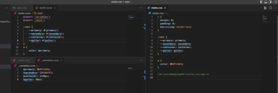
Importer des fichiers

SASS permet d’importer différents fichiers ; typiquement 1 fichier pour les variables, 1 fichiers pour les mixins, 1 fichier pour le reset, 1 fichier par type de composants… Par convention, les fichiers inclus commencent par un sous-tiret _.

Créons 3 fichiers :

  • _reset.scss
  • _variables.scss
  • styles.scss

Le contenu du fichier reset.scss :

Plain text
Copy to clipboard
Open code in new window
EnlighterJS 3 Syntax Highlighter
* {
margin: 0;
padding: 0;
box-sizing: border-box;
}
* { margin: 0; padding: 0; box-sizing: border-box; }
* {
    margin: 0;
    padding: 0;
    box-sizing: border-box;
}

Le contenu du fichier _variables.scss :

Plain text
Copy to clipboard
Open code in new window
EnlighterJS 3 Syntax Highlighter
$primary: #F53603;
$secondary: #3603F5;
$primary: #F53603; $secondary: #3603F5;
$primary: #F53603;
$secondary: #3603F5;

Le contenu du fichier styles.scss :

Plain text
Copy to clipboard
Open code in new window
EnlighterJS 3 Syntax Highlighter
@import 'variables';
@import 'reset';
a {
color: $primary;
}
@import 'variables'; @import 'reset'; a { color: $primary; }
@import 'variables';
@import 'reset';
a {
    color: $primary;
}

Le SCSS compilé donne :

Plain text
Copy to clipboard
Open code in new window
EnlighterJS 3 Syntax Highlighter
* {
margin: 0;
padding: 0;
box-sizing: border-box;
}
a {
color: #F53603;
}
* { margin: 0; padding: 0; box-sizing: border-box; } a { color: #F53603; }
* {
  margin: 0;
  padding: 0;
  box-sizing: border-box;
}
a {
  color: #F53603;
}

1 réponse à “Comprendre et utiliser SASS

Laisser une réponse

Votre adresse email ne sera pas publiée. Les champs obligatoires sont indiqués par *